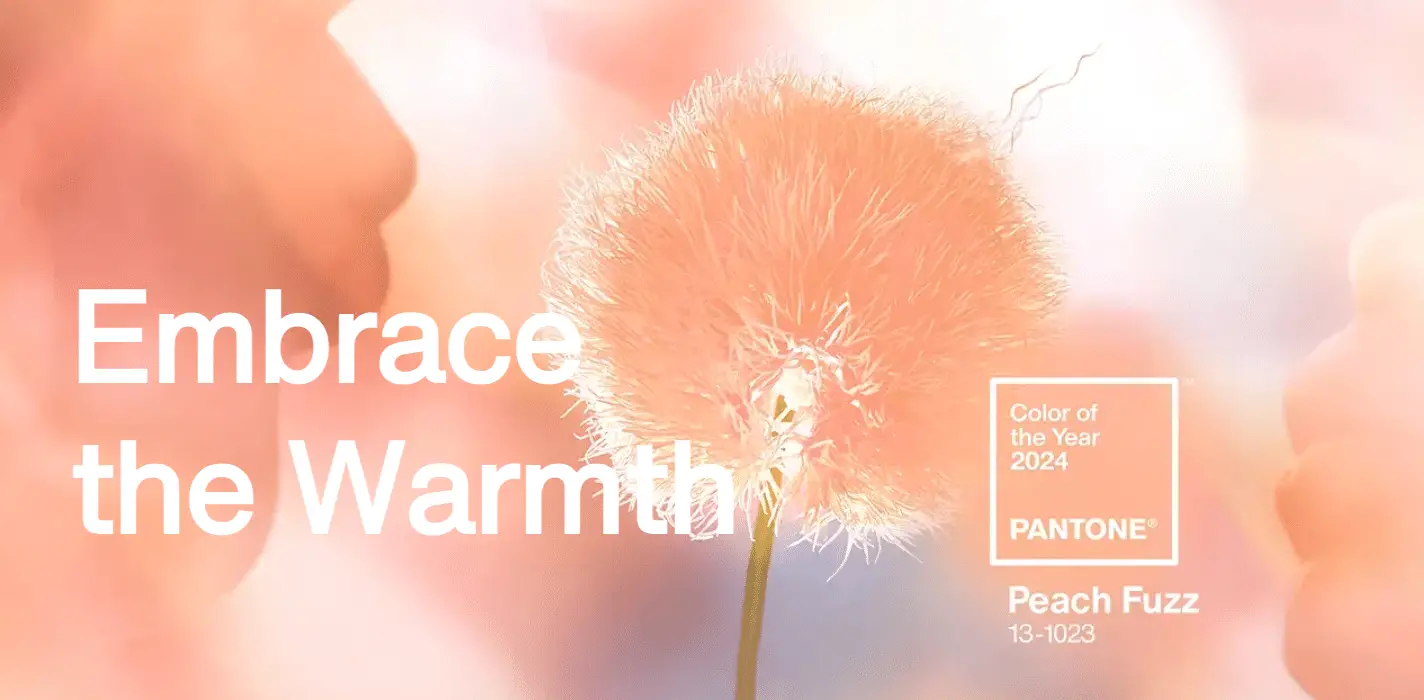
The Pantone Color Institute has unveiled its 2024 Color of the Year: PANTONE 13-1023 Peach Fuzz. This velvety gentle peach hue symbolizes an all-embracing spirit that enriches the heart, mind, and body. This selection marks a pivotal moment, celebrating the 25th anniversary of the Pantone Color of the Year program.

Pantone’s 2024 Color of the Year: Peach Fuzz

Peach Fuzz is a special color, like a soft mix of pink and orange. It’s not just any color – it makes you feel like you belong and helps you feel calm and cared for. It’s like a cozy blanket, giving you a feeling of peace. This color is perfect for spending time with others or just enjoying a quiet moment alone. It’s like a warm, gentle hug, making everything feel more comfortable and soothing.
Peach Fuzz in Design and Culture
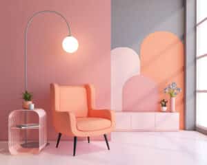
Sensitive yet sweet, it evokes a new modernity. It’s a sophisticated and contemporary peach with depth, bringing beauty to the digital world and enriching the human experience of nurturing the mind, body, and soul. Using this color in interior design can create a fresh, modern feel in your space. Here’s how you can apply this color effectively:
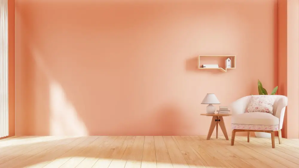
Accent Walls: Painting an accent wall in Peach Fuzz can instantly warm up the room and create a focal point. It’s a subtle yet effective way to introduce color without overwhelming the space.
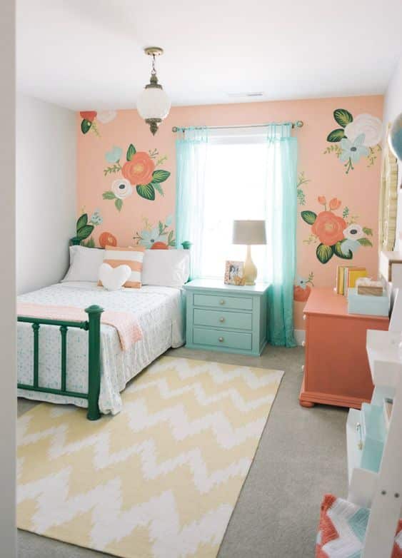
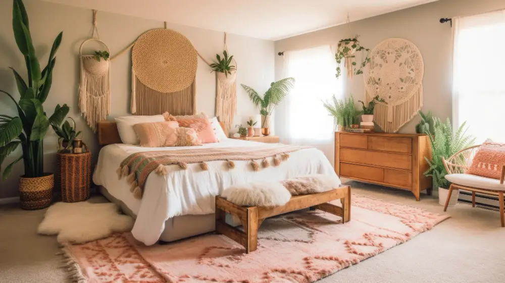
Soft Furnishings: Cushions, curtains, or throws in Peach Fuzz can add a cozy touch. This color works well with both neutral and bold palettes, making it versatile for various decor styles.
Artwork and Decor: Hang artwork that incorporates Peach Fuzz tones. You can also add vases, lamps, or other decor pieces in this color to sprinkle warmth throughout your room.
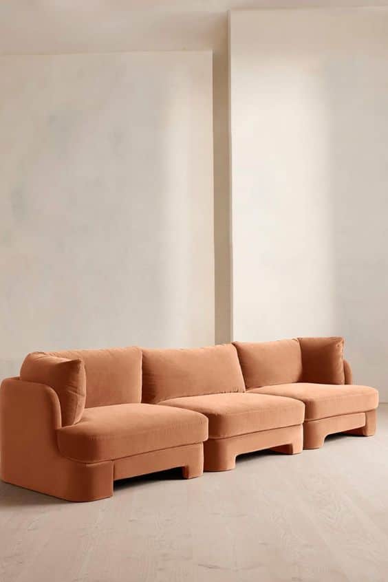
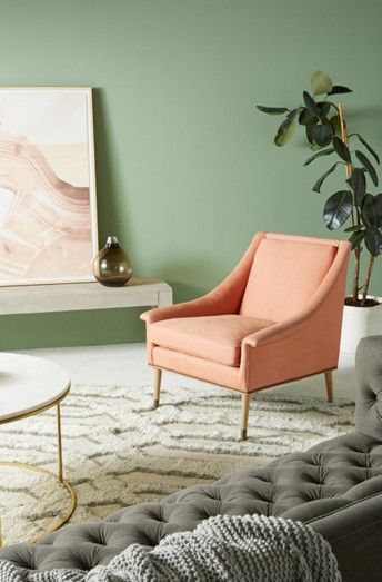
Furniture: A statement piece of furniture like a sofa or an armchair in this color can serve as a sophisticated centerpiece in your living space.
Bedding and Rugs: In bedrooms, Peach Fuzz bedding or a rug can create a serene and nurturing atmosphere, perfect for relaxation and comfort.
Kitchen and Bathroom Accents: Use it for kitchen backsplashes or bathroom tiles for a contemporary and chic look.
Complementary Colors: Pair with complementary colors like soft greens, blues, or even deeper shades of orange and pink to create a harmonious and balanced look.
Impact on Community and Lifestyle
Leatrice Eiseman, Executive Director of Pantone Color Institute, says, “In seeking a hue that echoes our innate yearning for closeness and connection, we chose a color radiant with warmth and modern elegance. A shade that resonates with compassion, offers a tactile embrace, and effortlessly bridges the youthful with the timeless.” Its warm embrace conveys compassion, bringing people together and enriching the soul. It’s a color that encourages a shift towards comfort and closeness.
Conclusion
As we embrace the 2024 color of the year, we are invited to find peace, comfort, and a sense of belonging. It’s a color that reflects our collective desire for recalibration, nurturing, and togetherness in a rapidly evolving world.
Related posts:
 Pink Interior Decor Ideas 2023: Your Ultimate Guide to Chic Elegance
 20 Purple Interior Design Ideas: Elevate Your Space Now
 Bedroom Color Ideas and Fresh Trends in 2024
 Average Cost to Paint Doors and Trim: A Complete Guide to a Beautiful Entryway
 Living Room Paint Ideas 2024: What’s Hot and What’s Not
